Table of Contents
In today’s mobile-first world, your brand’s logo must look crisp, clear, and consistent across all devices. That’s where a pixel-perfect logo comes in one that retains its quality and visual integrity regardless of screen size or resolution. In this guide, we’ll walk through how to design a pixel-perfect logo for responsive web design, covering essential tools, principles, and best practices.
What is a Pixel-Perfect Logo?

A pixel-perfect logo is designed with meticulous attention to detail, ensuring that each element aligns perfectly with the pixel grid. This approach prevents blurriness and distortion, especially on high-DPI (Retina) screens. In responsive web design, this means your logo should maintain clarity and proportion whether it’s viewed on a smartphone, tablet, laptop, or desktop.
Why Pixel Perfection Matters in Responsive Web Design
Before we dive into the design process, let’s understand why it’s essential:
- Clarity across devices: A blurry logo can damage your brand credibility.
- Faster loading: Properly optimized logos reduce file sizes, improving page speed.
- Scalability: Vector-based logos scale better without loss of quality.
- Consistent branding: A pixel-perfect logo reinforces a professional and trustworthy image.
Step 1: Start with a Vector Design

When designing a responsive logo, always start with a vector format using tools like Adobe Illustrator, Figma, or Sketch. Vectors are resolution-independent, allowing your logo to scale up or down without pixelation.
Best Practices:
- Design using the SVG format for web use.
- Keep your canvas aligned with a pixel grid.
- Use snap-to-grid settings to ensure perfect alignment.
Step 2: Embrace Simplicity for Responsiveness
In responsive design, logos often appear at smaller sizes. Intricate details may look great at full size but can become muddy when scaled down.
Design Tips:
- Avoid fine lines and excessive gradients.
- Focus on strong, bold shapes and legible typography.
- Create a responsive logo system (primary logo, icon-only version, and favicon).
Responsive Logo Examples:
- Google: Uses a full wordmark, a compact “G”, and a favicon.
- Spotify: Simplifies its logo into a minimal icon for mobile.
Step 3: Use a Grid System for Precision

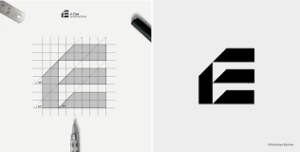
A grid system helps align elements symmetrically and maintain proportion. This is crucial for a pixel-perfect design and for ensuring your logo aligns well with other page elements in a layout.
Try:
- 8pt or 4pt grids for spacing.
- Baseline grids for typography.
- Golden ratio or modular grids for logo balance.
Using grids ensures each curve, corner, and character sits exactly where it should crisp and intentional.
Step 4: Optimize Logo Typography

Typography plays a big role in logo design. When choosing fonts, prioritize readability and scalability.
Font Optimization Tips:
- Use web-safe or embedded fonts.
- Convert fonts to outlines for SVGs to prevent rendering issues.
- Watch kerning and spacing at small sizes.
A font that looks elegant at 500px wide may be unreadable at 80px. Test at multiple breakpoints.
Step 5: Export in Multiple Sizes & Formats
To ensure pixel perfection, export your logo in a variety of sizes and formats tailored for the web.
Key Logo Formats for Responsive Web Design:
- SVG: Best for scalability and performance.
- PNG: Good for static, raster-based needs.
- WebP: Great for high-quality, compressed images.
- ICO: For favicons.
Suggested Sizes:
- Full Logo: 250–400px wide
- Compact Icon: 64×64px or 128×128px
- Favicon: 16×16px, 32×32px
Be sure to create @2x or @3x assets for retina and high-resolution screens.
Step 6: Implement with CSS for Flexibility
Responsive logos should adjust automatically with screen size. Implementing your logo with CSS and media queries gives you control over how and when different versions appear.
Step 7: Test Across Devices & Resolutions
Testing ensures your pixel-perfect logo stays perfect no matter where it’s viewed.
Test on:
- High-DPI screens (MacBook Pro, iPhones)
- Low-res Android devices
- Various browsers (Chrome, Safari, Firefox)
- Light and dark backgrounds
Use tools like BrowserStack, Responsively App, or Figma Mirror to preview your logo in real time.
Final Thoughts
Designing a pixel-perfect logo for responsive web design is part art, part science. It requires balancing aesthetics with technical precision to ensure your brand identity looks great everywhere from giant 4K monitors to pocket-sized phones.
By following vector-based design principles, using responsive techniques, and testing across devices, you can create a logo that is not only beautiful but also functional in every digital context
